BLOG |
|
This client had a huge basement, but her mother had just passed away and no one had been in the house for a bit...hence, they ended up with a mouse issue and decided to gut the whole basement. This was the basement as it was... Red carpeting, paneling...you get the picture. So the challenge was to get an in home movie theatre into the basement without compromising the space for the pool table...and also to add a card/game table area and sleeping space AND kitchenette/bar. A challenge but such fun! I put a layout together for them for their approval and then set about selecting the fun card table and movie seats, etc!
3 Comments
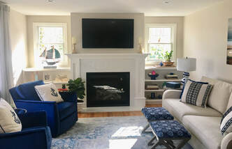
One of the things I like most about design is paint...it might also be one of the hardest things to get right. So many factors play into paint since it is all about light. A particular paint color might look beautiful in one room and horrible in the next depending on the direction the room faces, the amount of light the room gets, etc. Coastal palettes are fun...the trick is for things to feel light and airy and beachy....but not cheesy. Here is an example of a light and airy paint palette with beige and gray and blue tones I put together for a home in Hingham, MA. 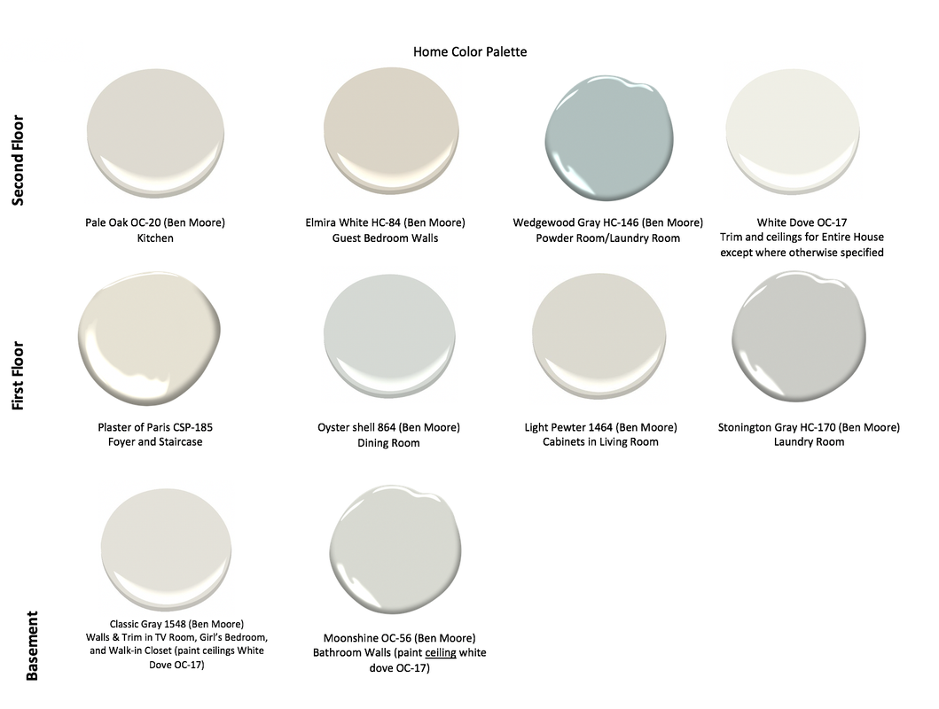 This home was recently purchased by a couple just retiring and looking forward to a fun life on Cape Cod. The home is lovely, but was in need of an update. See BEFORE picture below: 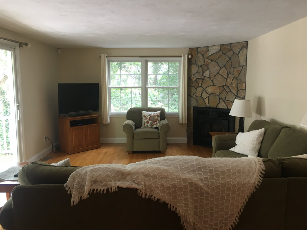 Their furniture was older and dark, the tile on the corner fireplace outdated, and the room which faces North was dark and dreary. Soooo...we changed a few things :). See the AFTER pictures below:  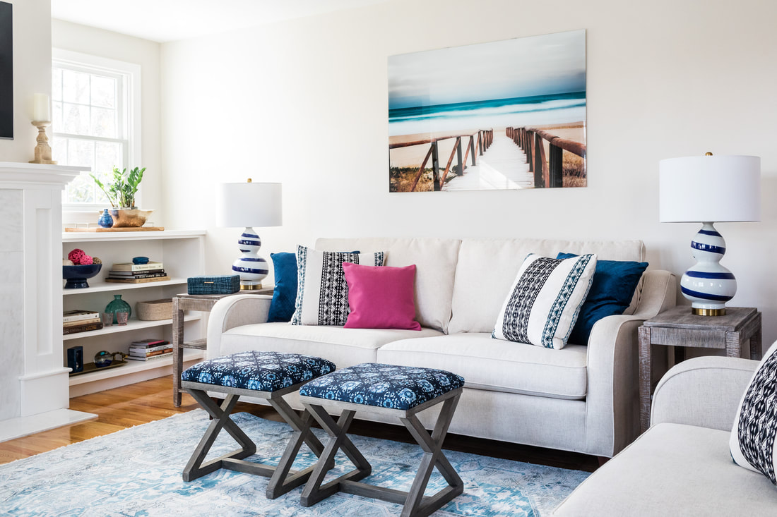 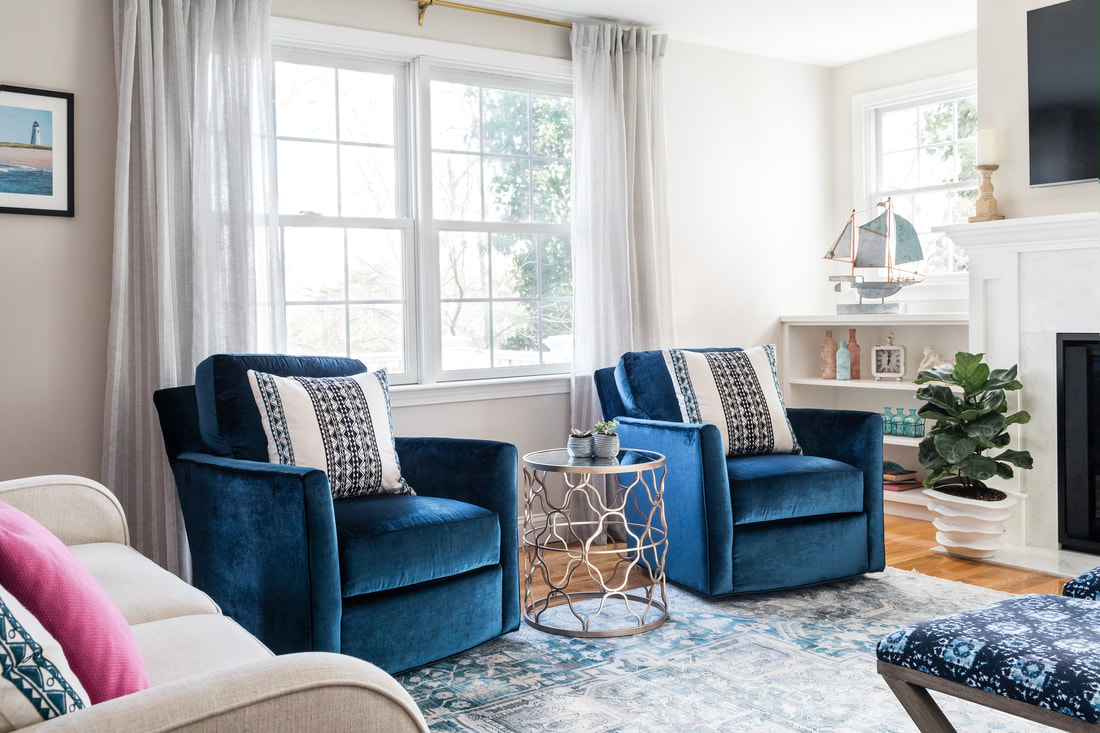 Proof that all you ever need to have a beautiful room is four walls :) We moved the fireplace and windows, changed the paint color and added new furnishings and PRESTO! A bright and beautiful new room. Here again is the BEFORE AND AFTER
 Oystershell 864 Oystershell 864 Wow...here we go...the first blog post for Sea Squared Design. In these blogs I will share things about design...there is so much to know and it is a constant learning process. One of the things I've been focusing on lately is paint color...SOOOO many paint colors out there and so hard to choose. So I'll try to blog about a good color every now and then. Let's talk about Benjamin Moore Oystershell 864. Great coastal color, especially for large rooms and open layouts. A gray/blue that looks more blue with more light and more gray with less light. Every time I use this color it gets rave reviews! Try it you'll like it...but use it in a room that gets a good amount of light or it will look too dull and gray. If you use it let me know how you liked it!  |
AuthorChristine Granfield is an interior designer who lives in Newton and Mashpee, MA. Archives
September 2020
Categories |

 RSS Feed